Welcome to my design blog.
While I have goals of amazing posts and writing about every launch, I'll level with you: You'll probably only find the occasional post here when I have a spare minute to write a bit. I typically focus my time working on client projects and being a mom, but I'll try my best to keep you updated with new things every so often.
the blog

Clickers vs. Scrollers
July 1, 2018
Today I’m going to give you a little insight into something I talk a lot with my clients about: Client experience on your website.
Have you noticed the shift, as you visit websites, from being a clicker to becoming a scroller? I’m going to take a guess that if you’re reading this, there’s a really good chance it’s on your phone and you’re probably doing that mindless thumb-scroll through all the info without really even noticing it. There is a definite shift to mobile viewing, and you probably get over 70% of your traffic from mobile devices.
We’ve become so used to our phones that we’ve become accustomed to scrolling through everything all the time, where we used to be more okay with clicking through lots of pages on a site and only having to scroll when there was a ton of text (which you probably never bothered to read anyway). You’ve probably noticed that every website you visit that’s been updated in the last few years has shifted to this mentality too – it mostly has to do with the social media boom and the shift to constant scrolling of Instagram, Facebook, Pinterest, etc. for that instant gratification of there always being MORE. More to read, more to scroll to, more info being shoved in your face.
But is that the best way – should we forget our clicker ways of the past and just move forward with our endless scrolling content?
In the words of Star Lord (because we have Guardians of the Galaxy on repeat over here), I recommend, “A bit of both.”
You’re still going to get people who like to click through websites, but you’re most certainly going to get scrollers to your site, so why not make it a great experience for both types of people? You actually NEED pages on your website because Google wants to see people moving through the site and you also don’t want to cram all of you info onto one or two pages that endlessly scroll forever.
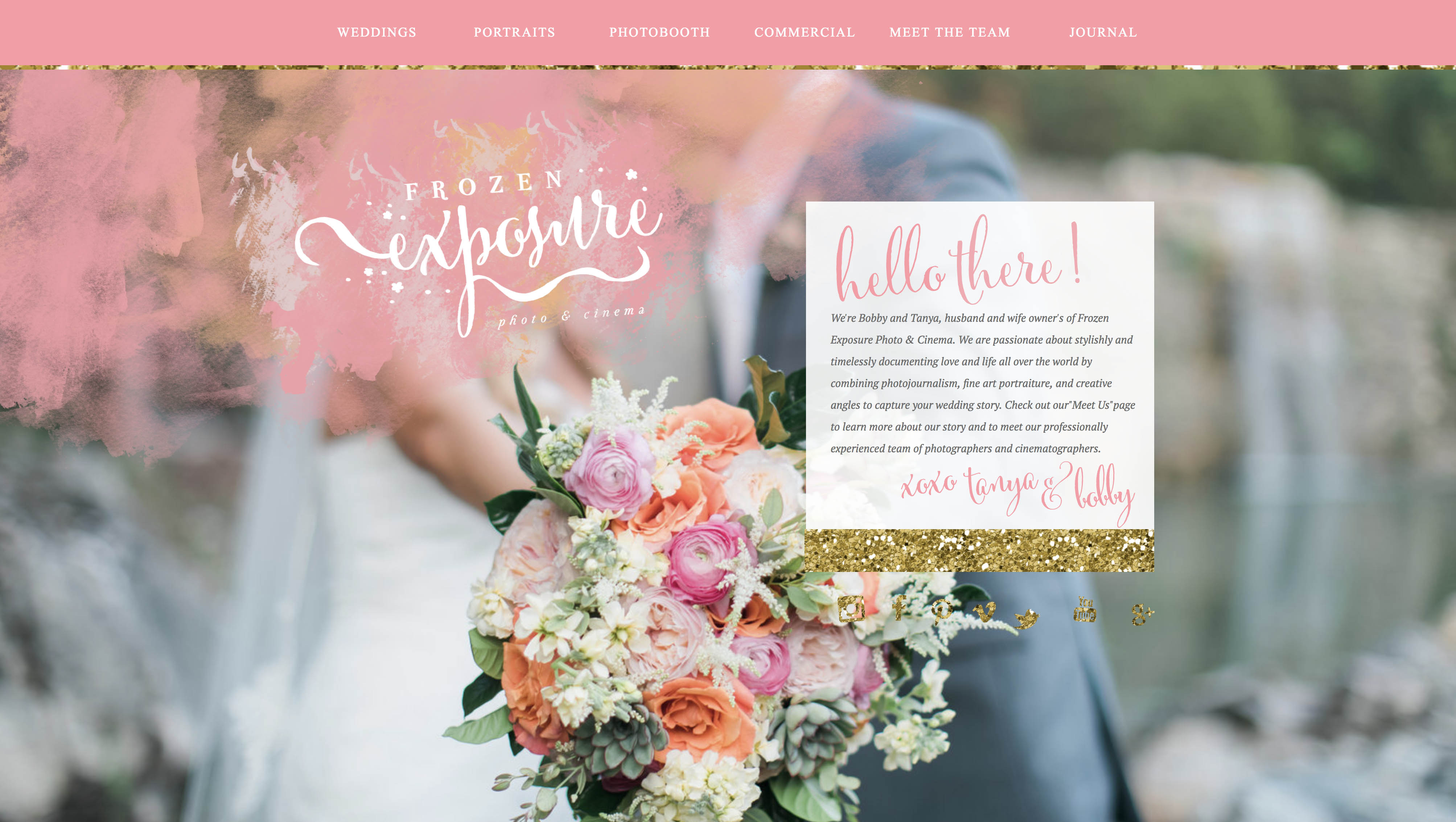
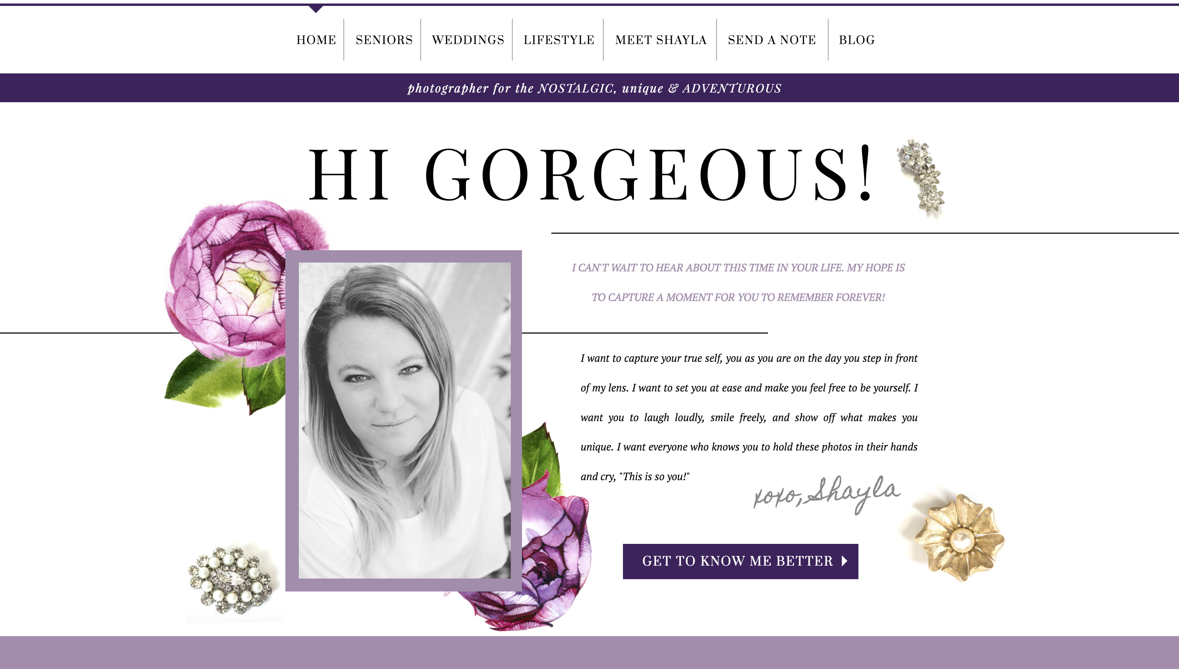
That is why I like to build site home pages as a central hub where you can get the gist of all the information on the site in a nutshell, with offshoots to more pages for more information if you want it. My homepages for the most part consist of some kind of gallery with a welcome area, a taste of your bio with a way to learn more on a bio page, some lead-ins to information and more details, ways to view more galleries or portfolio items, and then a contact form (with other items sprinkled in there).
Here are a few examples of central hub style home pages, which are particularly helpful when you are a photographer who shoots multiple things:
Most importantly, you should organize your content so that it is:
1. Easy to figure out what you do
2. Easy to find the info they are looking for
3. Gives all the info that you need to give
4. Makes it really easy to contact you without getting too distracted
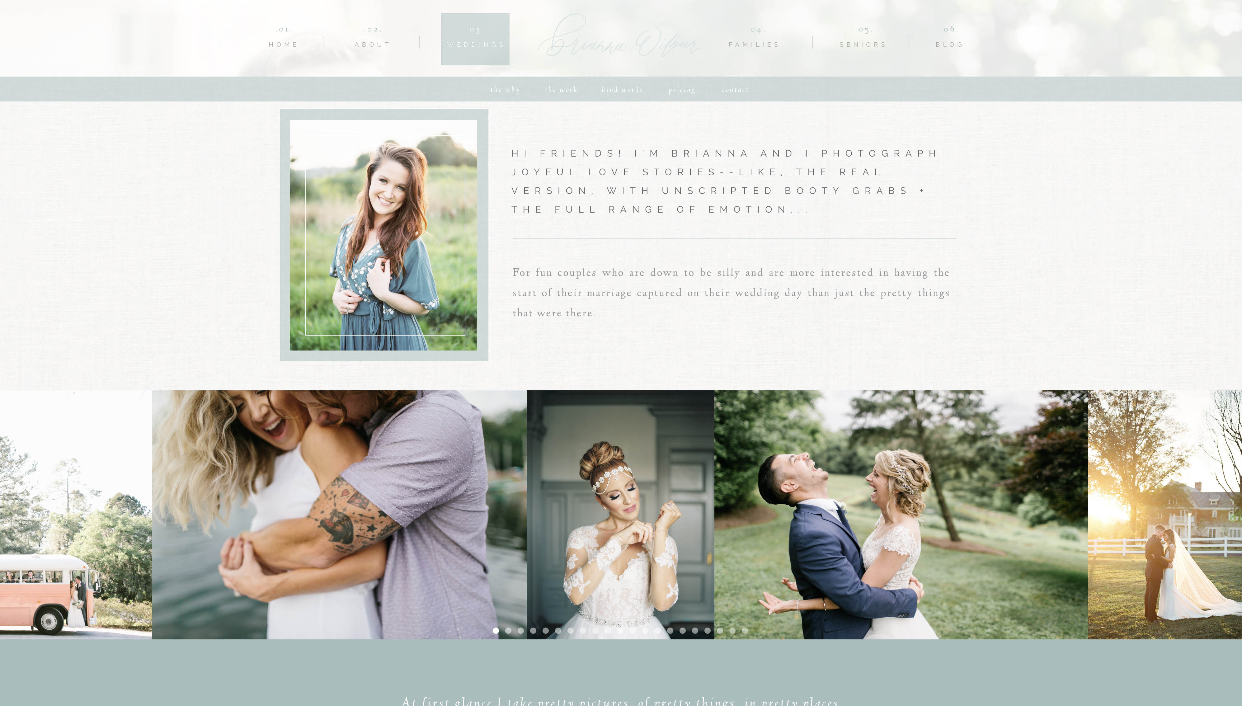
The biggest mistake you can make when designing a website like this is not taking the time to think through how you will organize it because it’s easy to get lost in pages and pieces of pages and not be able to find your way back to the actual contact form, which, let’s face it, is the ultimate goal! I’m a huge fan of the submenu like on Brianna’s site:
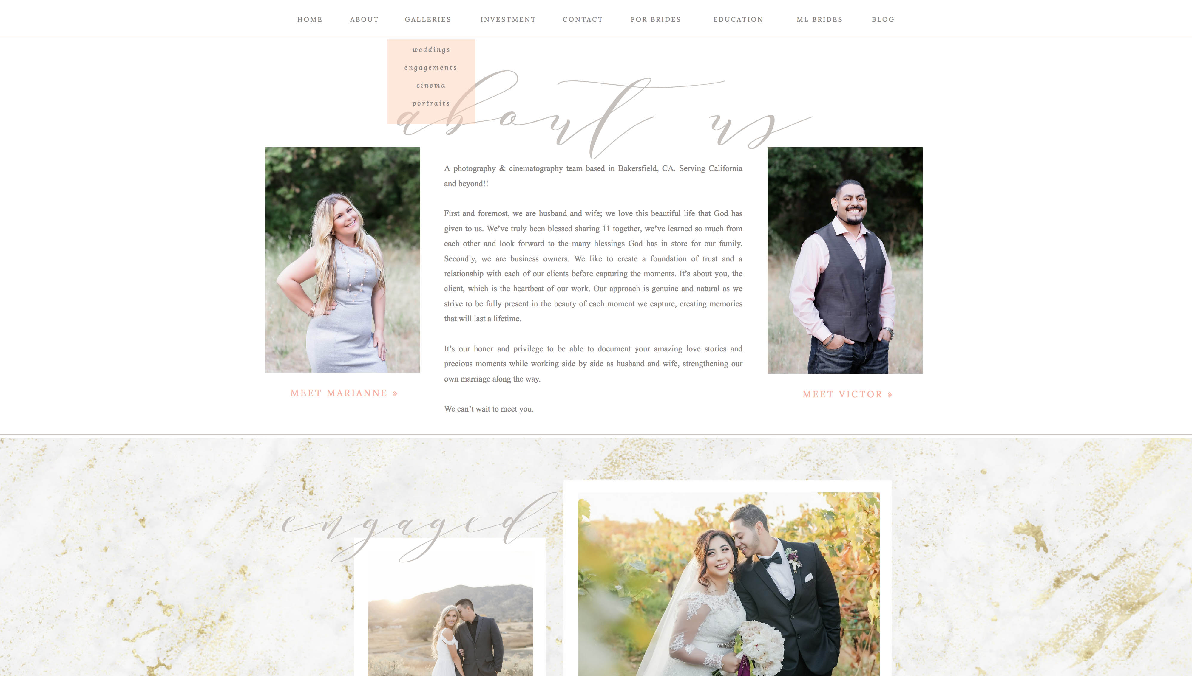
Dropdown menus are also great for leading people through your site like on Marianne Lucas’s site:
The bottom line is that no matter how short or how long your pages are, make sure that your visitors can move through them in the way that you intended, ultimately ending up (hopefully) contacting you because it’s super convenient for them to do so!


